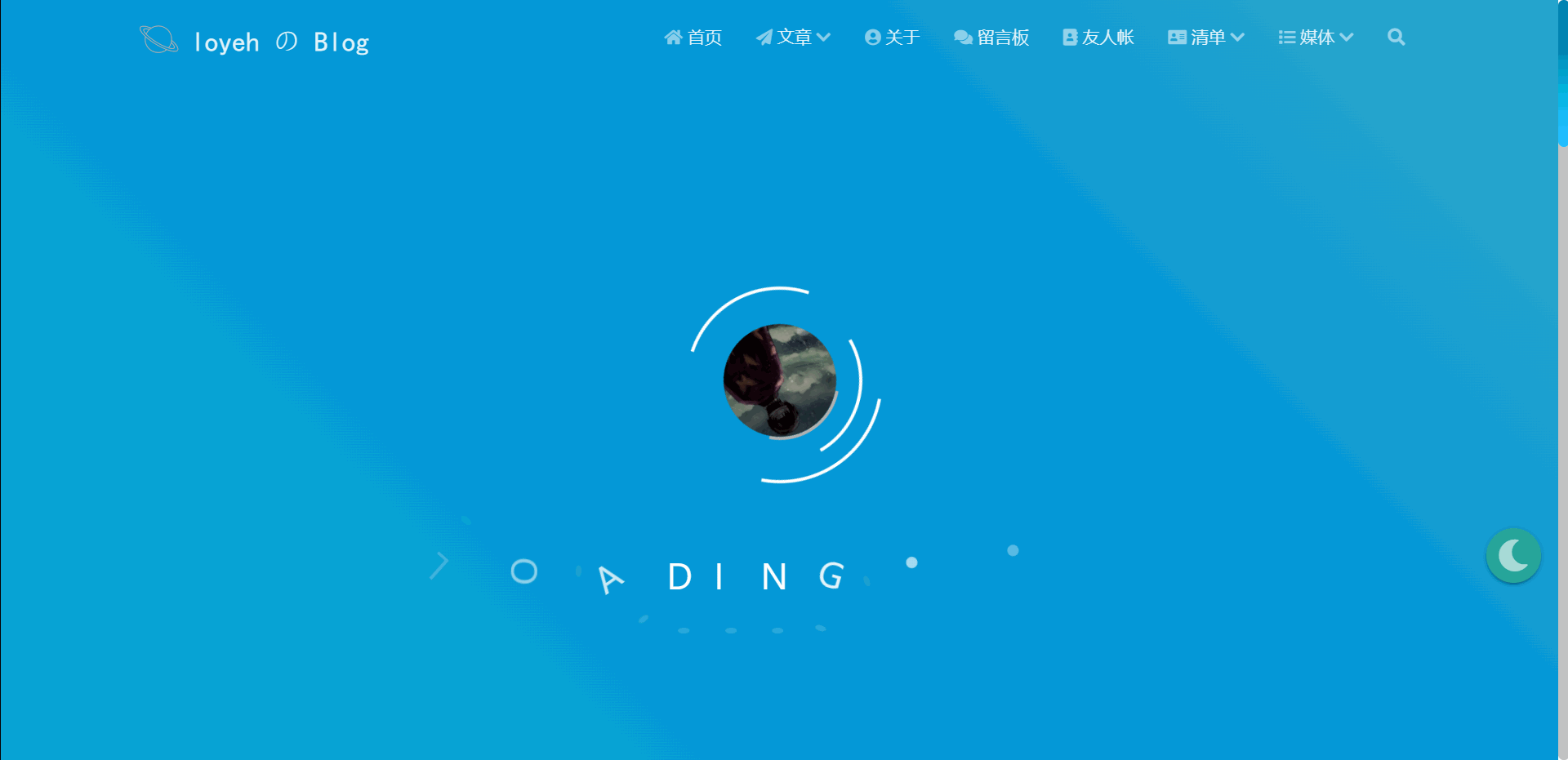
页面加载动画
今天的主题是为博客添加页面加载动画。
下面是页面加载动画的详细作用:
视觉吸引力: 页面加载动画可以增加页面的吸引力,使用户在等待页面加载时感到更加愉悦和有趣。精美的加载动画可以提升用户体验,增加用户对网站的好感度。
指示器: 加载动画可以作为页面加载的指示器,告诉用户页面正在加载中,以及加载进度如何。这可以帮助用户了解页面加载的状态,减少用户的不耐烦和不确定性。
心理安慰: 在加载较慢的情况下,页面加载动画可以给用户一种心理上的安慰,让他们知道页面正在工作,而不是出现了问题。这有助于降低用户的焦虑和流失率。
品牌展示: 页面加载动画也可以成为品牌的一部分,通过设计独特的加载动画来展示品牌的风格和特点,增强品牌形象。
综上所述,页面加载动画在提升用户体验方面都发挥着重要作用,是网页设计中常用的元素之一。
效果
实现
在
matery\source\css下新建loading.css,添加以下代码1
2
3
4
5
6
7
8
9
10
11
12
13
14
15
16
17
18
19
20
21
22
23
24
25
26
27
28
29
30
31
32
33
34
35
36
37
38
39
40
41
42
43
44
45
46
47
48
49
50
51
52
53
54
55
56
57
58
59
60
61
62
63
64
65
66
67
68
69
70
71
72
73
74
75
76
77
78
79
80
81
82
83
84
85
86
87
88
89
90
91
92
93
94
95
96
97
98
99
100
101
102
103
104
105
106
107
108
109
110
111
112
113
114
115
116
117
118
119
120
121
122
123
124
125
126
127
128
129
130
131
132
133
134
135
136
137
138
139
140
141
142
143
144
145
146
147
148
149
150
151
152
153
154
155
156
157
158
159
160
161
162
163
164
165
166
167
168
169
170
171
172
173
174
175
176
177
178
179
180
181
182
183
184
185
186
187
188
189
190
191
192
193
194
195
196
197
198
199
200
201
202
203
204
205
206
207
208
209
210
211
212
213
214
215
216
217
218
219
220
221
222
223
224
225
226
227
228
229
230
231
232
233
234
235
236
237
238
239
240
241
242
243
244
245
246
247
248
249
250
251
252
253
254
255
256
257
258
259
260
261
262
263
264
265
266
267
268
269
270
271
272
273
274
275
276
277
278
279
280
281
282
283
284
285
286
287
288
289
290
291
292:root {
--primary-color: #fff;
/* 使用变量定义主要颜色 */
}
* {
margin: 0;
padding: 0;
box-sizing: border-box;
}
body {
height: 100vh;
}
.loader-wrapper {
position: fixed;
left: 0;
top: 0;
z-index: 1;
width: 100%;
height: 100%;
overflow: hidden;
background: linear-gradient(45deg, rgb(90, 54, 148) 0%, rgb(19, 189, 206) 33%, rgb(0, 148, 217) 66%, rgb(111, 199, 181) 100%);
background-size: 400%;
background-position: 0% 100%;
animation: gradient 7.5s ease-in-out infinite;
}
.loader,
.loader::before,
.loader::after,
.loader img {
border-radius: 50%;
position: absolute;
border: 3px solid transparent;
border-top-color: var(--primary-color);
}
.loader {
width: 150px;
height: 150px;
left: 50%;
top: 50%;
margin-left: -75px;
margin-top: -75px;
z-index: 2;
display: flex;
justify-content: center;
align-items: center;
animation: spin 1.7s linear infinite;
}
.loader::before {
content: "";
position: absolute;
top: 5px;
left: 5px;
bottom: 5px;
right: 5px;
animation: spin 0.6s linear infinite reverse;
}
.loader::after {
content: "";
position: absolute;
top: 15px;
left: 15px;
bottom: 15px;
right: 15px;
animation: spin 1s linear infinite;
}
.loader img {
width: 100%;
height: 100%;
object-fit: cover;
border-radius: 50%;
animation: spin 1.7s linear infinite reverse;
}
.loader-text {
width: 50%;
height: 36px;
position: absolute;
top: 72%;
left: 50%;
transform: translateX(-50%);
z-index: 3;
user-select: none;
}
.loader-text div {
width: 30px;
height: 36px;
color: var(--primary-color);
font-size: 32px;
margin: 0 20px;
position: absolute;
opacity: 0;
transform: rotate(180deg);
animation: move 2s linear infinite;
}
.loader-text div:nth-child(8)::before,
.loader-text div:nth-child(9)::before,
.loader-text div:nth-child(10)::before {
content: "";
width: 10px;
height: 10px;
border-radius: 50%;
background-color: var(--primary-color);
position: absolute;
left: 0;
bottom: 0;
}
.loader-text div::after,
.loader-text div:nth-child(8)::after,
.loader-text div:nth-child(9)::after,
.loader-text div:nth-child(10)::after {
content: "";
width: 10px;
height: 5px;
border-radius: 50%;
background-color: rgba(255, 255, 255, 0.15);
position: absolute;
bottom: -40px;
left: 50%;
margin-left: -5px;
}
.loader-text div:nth-child(8)::after,
.loader-text div:nth-child(9)::after,
.loader-text div:nth-child(10)::after {
left: 0;
margin-left: 0;
}
.loader-text div:nth-child(2) {
animation-delay: 0.2s;
}
.loader-text div:nth-child(3) {
animation-delay: 0.4s;
}
.loader-text div:nth-child(4) {
animation-delay: 0.6s;
}
.loader-text div:nth-child(5) {
animation-delay: 0.8s;
}
.loader-text div:nth-child(6) {
animation-delay: 1s;
}
.loader-text div:nth-child(7) {
animation-delay: 1.2s;
}
.loader-text div:nth-child(8) {
animation-delay: 1.4s;
}
.loader-text div:nth-child(9) {
animation-delay: 1.6s;
}
.loader-text div:nth-child(10) {
animation-delay: 1.8s;
}
@keyframes gradient {
50% {
background-position: 100% 0%;
}
}
@keyframes spin {
0% {
transform: rotate(0);
}
100% {
transform: rotate(360deg);
}
}
@keyframes move {
0% {
right: 0;
opacity: 0;
}
35% {
right: 41%;
opacity: 1;
transform: rotate(0);
}
65% {
right: 59%;
opacity: 1;
transform: rotate(0);
}
100% {
right: 100%;
transform: rotate(-180deg);
}
}
/* 小屏幕下(手机类)的样式 */
@media only screen and (max-width: 601px) {
.loader {
width: 100px;
height: 100px;
margin-left: -50px;
margin-top: -50px;
}
.loader img {
width: 45%;
height: 45%;
}
.loader-text {
width: 70%;
font-size: 20px;
}
.loader-text div {
width: 20px;
height: 24px;
font-size: 18px;
}
}
/* 中等屏幕下(平板类)的样式 */
@media only screen and (min-width: 600px) and (max-width: 992px) {
.loader {
width: 120px;
height: 120px;
margin-left: -60px;
margin-top: -60px;
}
.loader img {
width: 50%;
height: 50%;
}
.loader-text {
width: 60%;
font-size: 28px;
}
.loader-text div {
width: 25px;
height: 30px;
font-size: 24px;
}
}
/* 大屏幕下(桌面类)的样式 */
@media only screen and (min-width: 993px) {
.loader {
width: 180px;
height: 180px;
margin-left: -90px;
margin-top: -90px;
}
.loader img {
width: 60%;
height: 60%;
}
.loader-text {
width: 50%;
font-size: 36px;
}
.loader-text div {
width: 30px;
height: 36px;
font-size: 32px;
}
}在
matery\layout\_partial新建loading.ejs1
2
3
4
5
6
7
8
9
10
11
12
13
14
15
16
17
18
19
20
21
22
23
24
25
26
27
28
29
30
31<% if (theme.loadingPages.enable) { %>
<div id="loader-box">
/* 你的 HTML 代码将放在这里 */
<div class="loader-wrapper">
<div class="loader">
<img src="" alt=""> /* 填写你的头像路径 */
</div>
<div class="loader-text">
<!-- 10个div -->
<div>L</div>
<div>O</div>
<div>A</div>
<div>D</div>
<div>I</div>
<div>N</div>
<div>G</div>
<div></div>
<div></div>
<div></div>
</div>
</div>
<script>
var endLoading = function () {
document.body.style.overflow = 'auto';
document.getElementById('loader-box').remove();
}
window.addEventListener('load', endLoading);
</script>
</div>
<% } %>部署到本地,查看并调试效果