页脚波浪效果
合适的页脚动画可以为网站带来更好的用户体验,增加用户的停留时间和互动频率,同时也有助于提升网站的整体吸引力。
这里推荐一个提供众多页脚动画的网址
这里我选择的页脚波浪效果
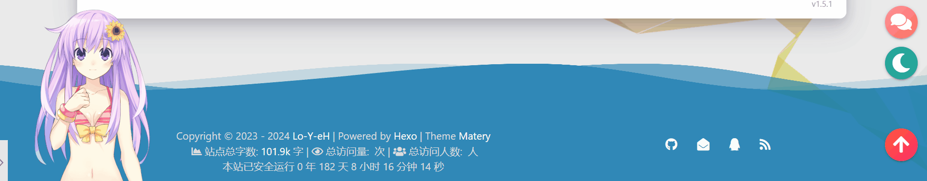
效果预览
实现步骤
在matery/source/css下新建footer_wave.css,写入如下代码
1
2
3
4
5
6
7
8
9
10
11
12
13
14
15
16
17
18
19
20
21
22
23
24
25
26
27
28
29
30
31
32
33
34
35
36
37
38
39
40
41
42
43
44
45
46
47
48
49
50
51
52
53
54
55
56
57
58
59
60
61
62
63
64
65
66
67
68
69
70
71
72
73
74
75
76
77
78
79
80
81
82
83
84
85
86
87
88
89
90
91
92
93
94
95
96
97
98
99
/* 设置页脚的顶部外边距为 120px */
footer {
margin-top: 120px;
}
/* 设置波浪容器的定位为相对定位 */
footer .fot-wave-box {
position: relative;
}
/* 设置波浪的样式 */
footer .fot-wave {
position: absolute;
/* 使波浪位于页脚上方 125px 处 */
top: -125px;
left: 0;
width: 100%;
height: 100px;
}
/* 第一个波浪的样式 */
footer .fot-wave#fot-wave_0 {
z-index: 10;
opacity: 1;
bottom: 0;
/* 应用波浪动画 */
animation: aniFotWaveMove_00 4s linear infinite;
}
/* 第二个波浪的样式 */
footer .fot-wave#fot-wave_1 {
z-index: 9;
opacity: .5;
bottom: 10px;
/* 应用波浪动画 */
animation: aniFotWaveMove_01 4s linear infinite;
}
/* 第三个波浪的样式 */
footer .fot-wave#fot-wave_2 {
z-index: 10;
opacity: .2;
bottom: 15px;
/* 应用波浪动画 */
animation: aniFotWaveMove_00 3s linear infinite;
}
/* 第四个波浪的样式 */
footer .fot-wave#fot-wave_3 {
z-index: 9;
opacity: .7;
bottom: 20px;
/* 应用波浪动画 */
animation: aniFotWaveMove_01 3s linear infinite;
}
/* 定义波浪的移动动画 */
@keyframes aniFotWaveMove_00 {
0% {
background-position-x: 1000px;
}
100% {
background-position-x: 0;
}
}
/* 定义波浪的移动动画 */
@keyframes aniFotWaveMove_01 {
0% {
background-position-x: 0;
}
100% {
background-position-x: 1000px;
}
}
/* Safari 浏览器下的兼容性样式 */
@-webkit-keyframes aniFotWaveMove_00 {
0% {
background-position-x: 1000px;
}
100% {
background-position-x: 0;
}
}
/* Safari 浏览器下的兼容性样式 */
@-webkit-keyframes aniFotWaveMove_01 {
0% {
background-position-x: 0;
}
100% {
background-position-x: 1000px;
}
}代码解读:
.fot-wave-box类的 CSS 规则用于设置页脚波浪的容器的位置为相对定位(position: relative),这意味着其子元素的绝对定位(position: absolute)将相对于此容器定位。footer元素的 CSS 规则用于设置页脚的上外边距为 120px。.fot-wave类的 CSS 规则用于设置波浪的样式,将其位置设置为绝对定位,位于页面顶部上方 100px 处,宽度为 100%,高度为 100px。.fot-wave的具体实例(#fot-wave_0,#fot-wave_1,#fot-wave_2,#fot-wave_3)分别设置了不同的样式参数,包括层级(z-index)、透明度(opacity)、底部位置(bottom)以及动画效果。@keyframes和@-webkit-keyframes规则定义了两种不同的动画效果(aniFotWaveMove_00和aniFotWaveMove_01),分别控制波浪的水平移动,从而实现波浪的动态效果。
综上所述,这段代码主要是用于创建一个具有动态波浪效果的页脚。
注意footer .fot-wave样式中的
top需要根据自己的底部信息栏的高度进行设置在
matery\layout\_partial\footer.ejs的最上方插入以下代码1
2
3
4
5
6
7
8
9
10
11
12
13
14
15
16
17
18
19
20
21
22<!-- 添加页脚波浪代码 -->
<link rel="stylesheet" type="text/css" href="/css/footer_wave.css">
<style>
footer .fot-wave {
background: url(/medias/wave.png) repeat-x;
background-size: 1000px 100px;
/* 添加 */
background-repeat: repeat-x; /* 设置波浪在水平方向重复 */
position: absolute;
bottom: 0;
left: 0;
width: 100%; /* 波浪宽度 */
height: 100px; /* 波浪高度 */
z-index: 1; /* 确保波浪在内容上方显示 */
}
</style>
<div class="fot-wave-box">
<div class="fot-wave" id="fot-wave_0"></div>
<div class="fot-wave" id="fot-wave_1"></div>
<div class="fot-wave" id="fot-wave_2"></div>
<div class="fot-wave" id="fot-wave_3"></div>
</div>最后进行部署查看效果即可,另外还有一点,最好设置自己的标签栏的颜色和波浪的颜色保持一致,效果才不会显得突兀
Gets
本次优化页脚的过程中学到了以下几点:
在CSS中,
repeat-x是一个背景重复属性值,它指定背景图像沿着水平方向平铺重复显示,但不在垂直方向重复。换句话说,背景图像将在水平方向上重复,直到填满整个容器,但在垂直方向上不重复。这对于创建水平平铺背景图像非常有用,比如在页脚或者横幅中使用横向的图案或者波浪线条。大多数现代浏览器都支持标准的
box-shadow属性,无需再单独使用-webkit-box-shadow属性针对不同浏览器的前缀是为了确保在不同的浏览器上能够正确地解析和显示样式。由于不同的浏览器厂商在实现CSS标准时可能存在差异,因此在一些新特性或实验性的CSS属性上,开发者需要使用特定浏览器厂商的前缀来确保样式能够正确应用。
以下是一些常见的浏览器前缀及其对应的浏览器:
-webkit-: 适用于WebKit内核的浏览器,例如Chrome和Safari。-moz-: 适用于Gecko内核的浏览器,例如Firefox。-ms-: 适用于Internet Explorer浏览器。-o-: 适用于Opera浏览器。
这些前缀在CSS属性之前添加,以指示特定的样式适用于特定的浏览器。例如,
-webkit-transform用于指定Webkit浏览器的变换样式,而-moz-transform用于指定Firefox浏览器的变换样式。在过去,由于浏览器的差异性较大,使用浏览器前缀是确保样式兼容性的关键。但随着现代浏览器对CSS标准的更好支持,以及自动供应商前缀的工具的出现,开发者在编写CSS时需要添加浏览器前缀的情况已经大大减少。